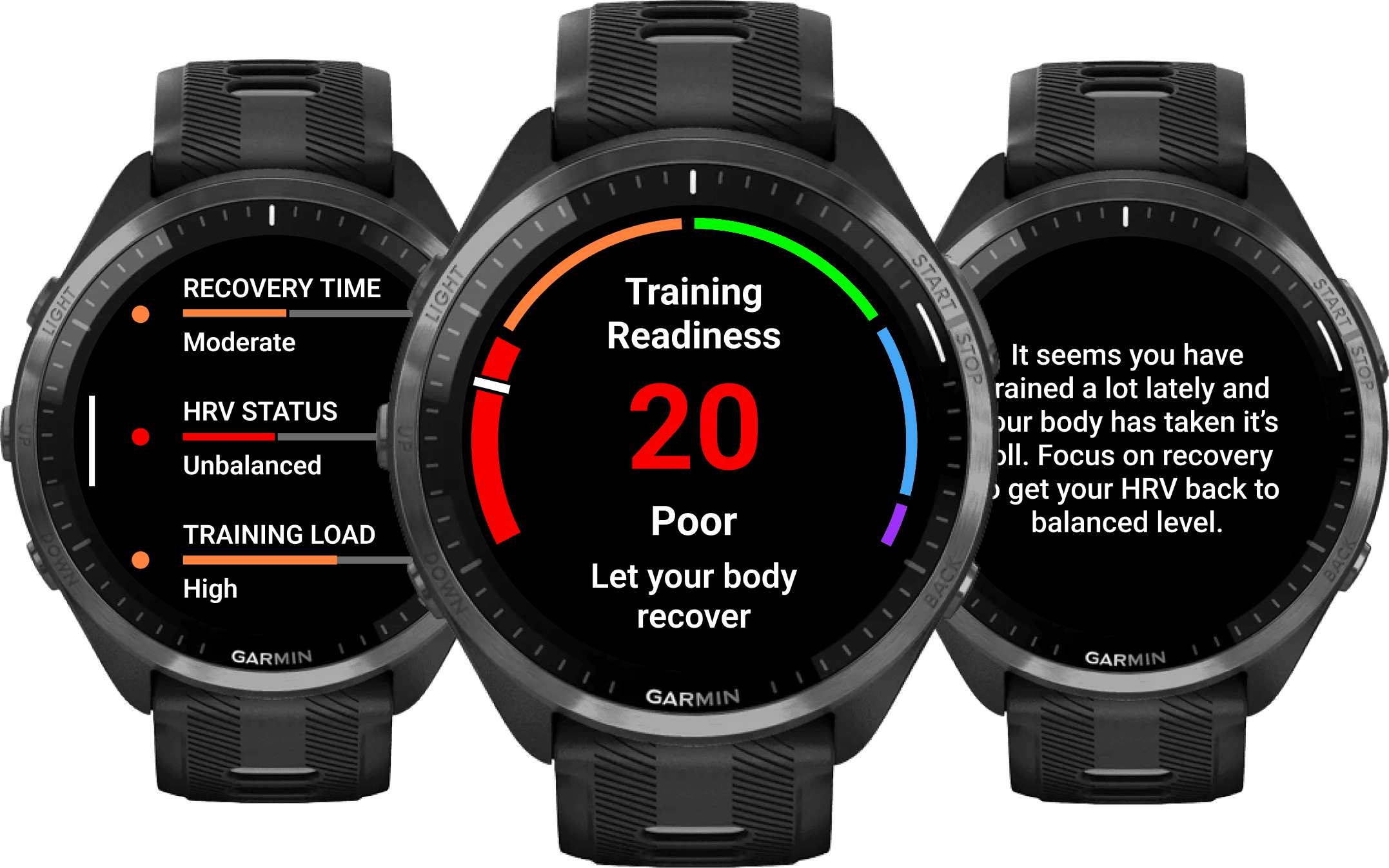
TRAINING READINESS
Know when to push and when
to let yourself recover
Connecting different metrics to one
metric that is easy to understand.
Garmin watches had multiple different features focusing on training, sleep, and recovery. However they weren't really talking to each other, and the data was spread to multiple places.
There was a clear need for a metric that would combine the metrics together and work as your daily coach that tells you how hard you can push today, or whether you should take it easier to avoid overreaching yourself.
We wanted to create a easy-to-understand metric, that provides you the information on how ready you are to train today.
The feature also needs to provide guidance for you on a daily basis and before you are actually heading out to train to inform whether today is the day to push harder, or whether you should take it easier.
People who are enthusiastic about fitness and exercising, but who may need a bit of extra support and guidance to manage their training load, and reach their goals.
Athletes who already possess good knowledge about how to achieve their training goals, but who are in need of holistic information about their body and training.
As a lead designer of the product my responsibilities was to be responsible for maintaining the design process from the start to the final product, including discovery & definement, ideation & concepting, evaluation & iteration, and supporting developers with implementation.
Since this project was heavily based on science, and data. It required almost daily collaboration with physiologists, and data engineers to maintain the scientifical aspect of the feature. Every piece of information provided in feature is backed by the science.
Clear need for a metric that provides a view into users overall health and recovery.
Competitor analysis
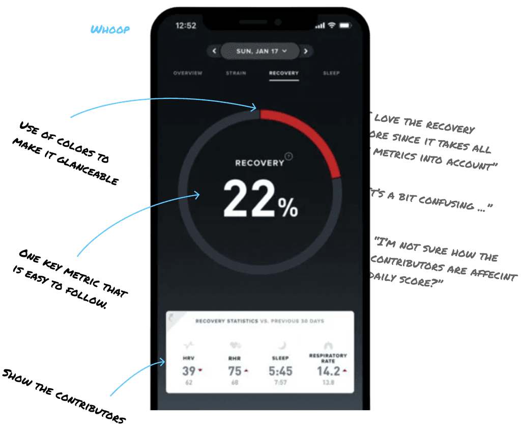
I conducted competitor research/analysis on what's going on at the market, and it seemed like people are really interested in having further recovery metrics, that goes beyond their training.
Also, me and the team took a closer look into user feedback we had received from our users, and our UX Researchers conducted surverys to find out which areas people would need support on.
There were clear need for more proactive guidance to let athletes know what to do before their training.
Example of one of the competitor solutions on my competitor analysis. I don’t have access to actual research file anymore.
I conducted ideation workshops to create more ideas and concepts together with the team, and tested them with our researchers to find out what works and what not.
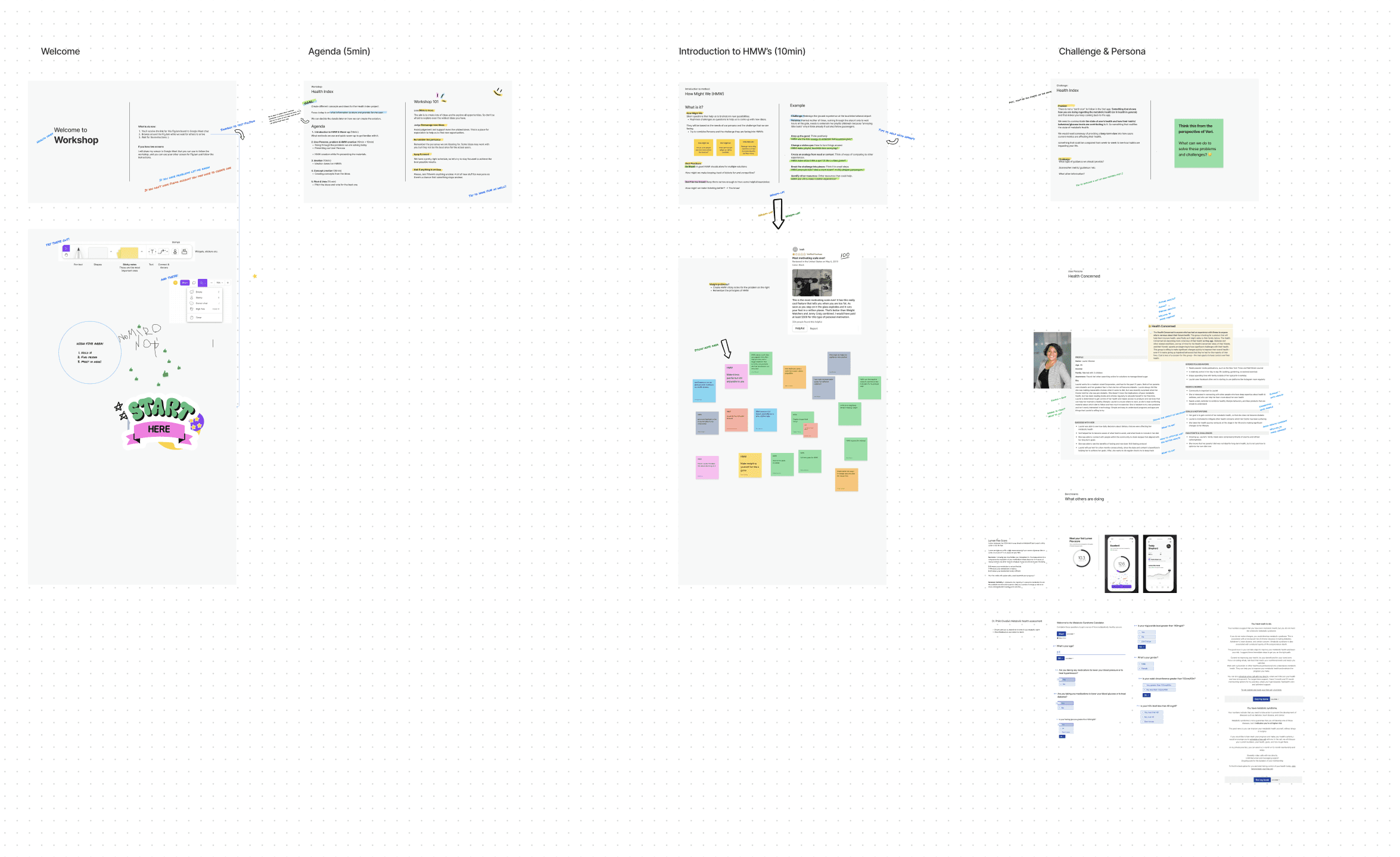
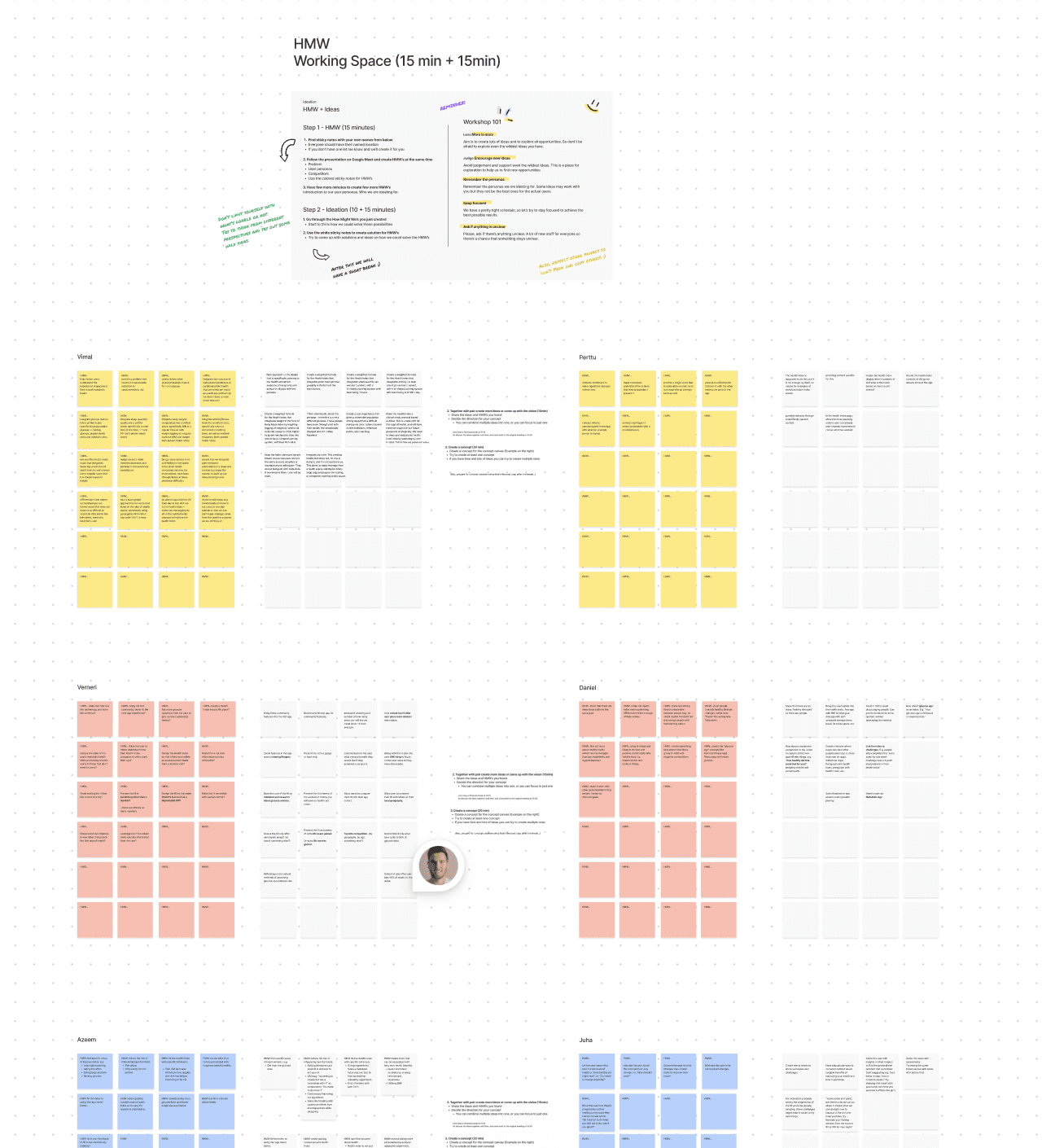
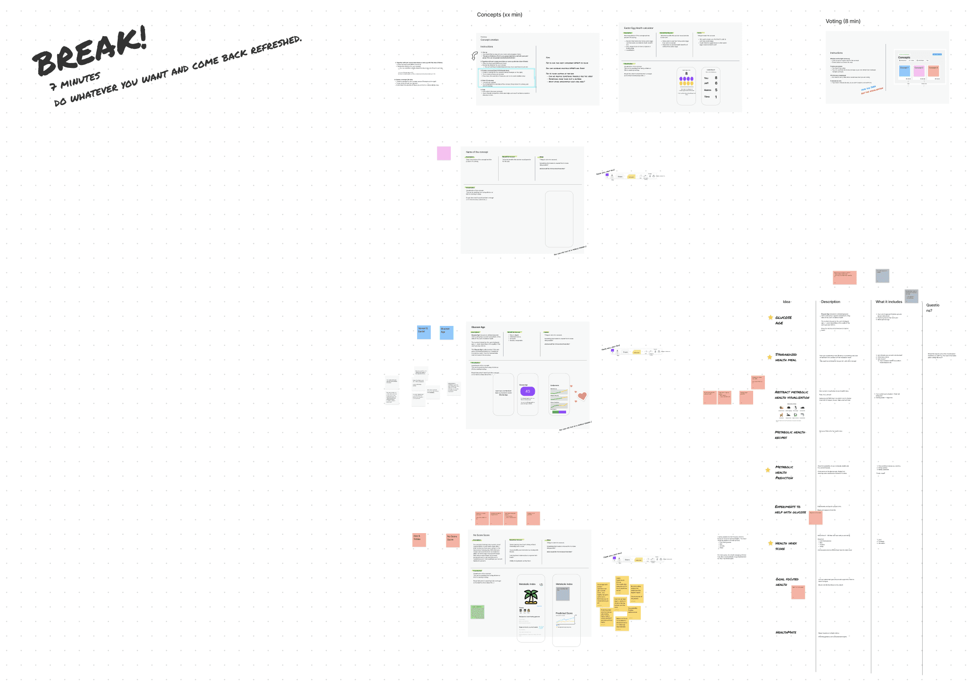
I conducted ideation workshops with our team to discover different ideas and concepts.
Utilized "How might we" cards, and ideation and concept creation in small groups which was then shared for the others.
I developed the concepts further and together with our UX Researcher we tested them with real users, to see what concepts and aspects were working and what were not.
Note: Also HRV Status concept was built on these concepts.
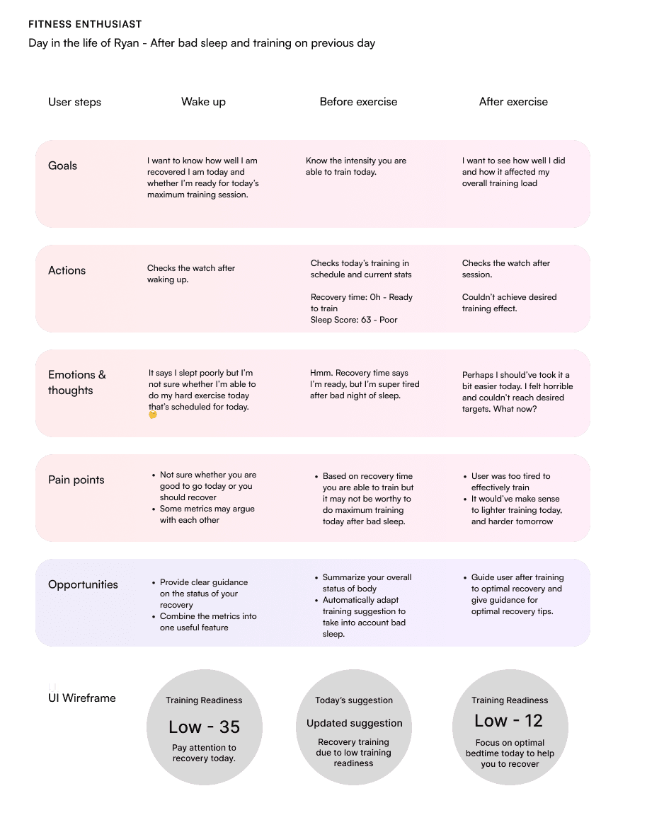
I created user journey maps to figure out better what are the most important aspects that needed to be solved with the project.
These were also highly beneficial when communicating with different stakeholders, and helped to discuss different pain points and possibilities along the project.
Examples of the similar workshops I've conducted later on various topics
Examples of the concepts I created together with team
Your readiness for today is not optimal today based on your training recovery, stress, and sleep levels.
We suggest you either taking a rest day today, or having a recovering activity like Yoga today.
CONCEPT 3

Your readiness for today is not optimal today based on your training recovery, stress, and sleep levels.
We suggest you either taking a rest day today, or having a recovering activity like Yoga today.
CONCEPT 2 - ADAPTIVE TRAINING PLAN

Your readiness for today is not optimal today based on your training recovery, stress, and sleep levels.
We suggest you either taking a rest day today, or having a recovering activity like Yoga today.
CONCEPT 1 - HOLISTIC COACH
We wanted to be sure that different UI's were not affecting the results too much, so we tested concepts with these comic strips that I created.
Example of the user journey mapping I did during the project.
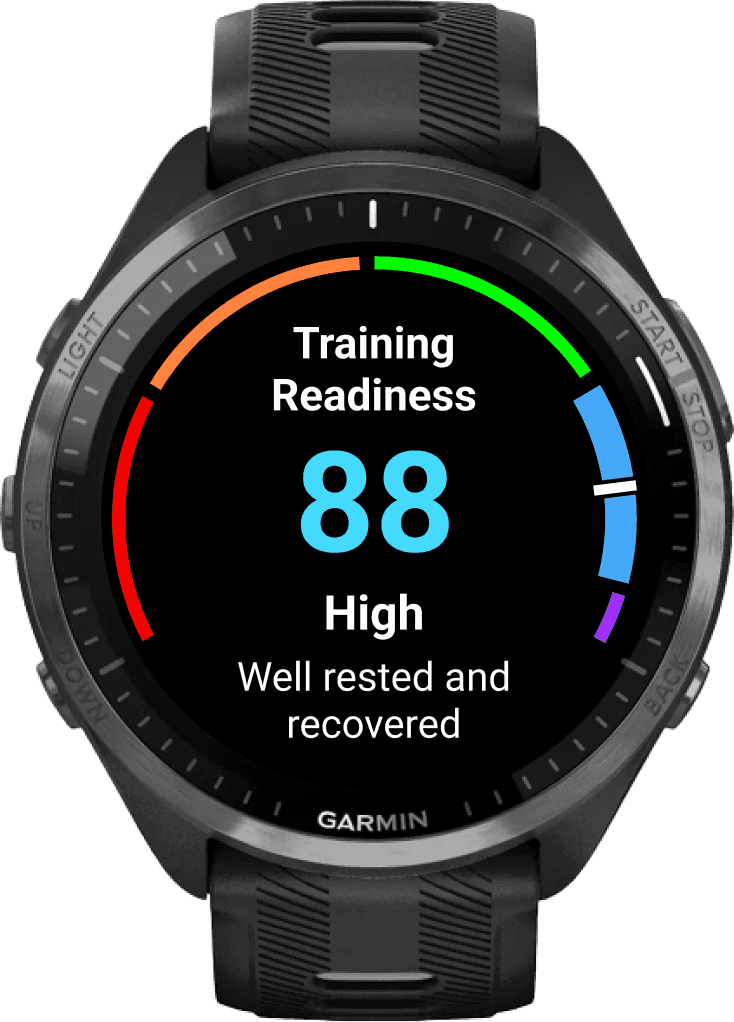
Concepts were taken further and through few rounds of concept testing we landed with the Training Readiness. It was well liked and feedback was really positive.
Concept testing
The concepts were tested on a higher level to find what aspects were liked and what were not. From these foundings we created few final features that was then finetuned and eventually implemented later on.
E.g. Training Readiness & HRV Status
Feature testing
After landing with the concepts we went deeper with the HRV Status, and created the main flows, and UI's and tested them with our users, to find out what their feelings were.
Test results were also important because they helped us to pitch the feature further to internal decisionmakers.
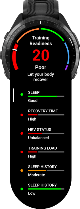
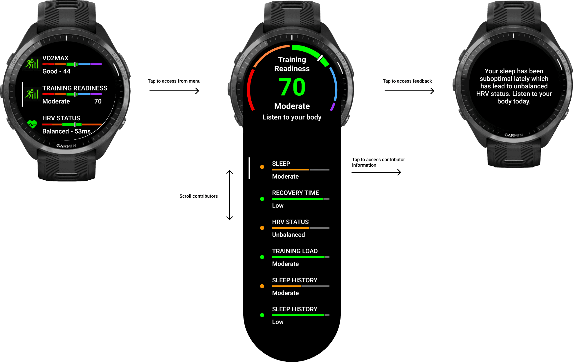
Due to limited screen estate in watch, and the Garmin's design system that the OS is running. There were some difficulties in fitting the contributors in, but eventually I came up with end result that didn't require to build any new components to OS.
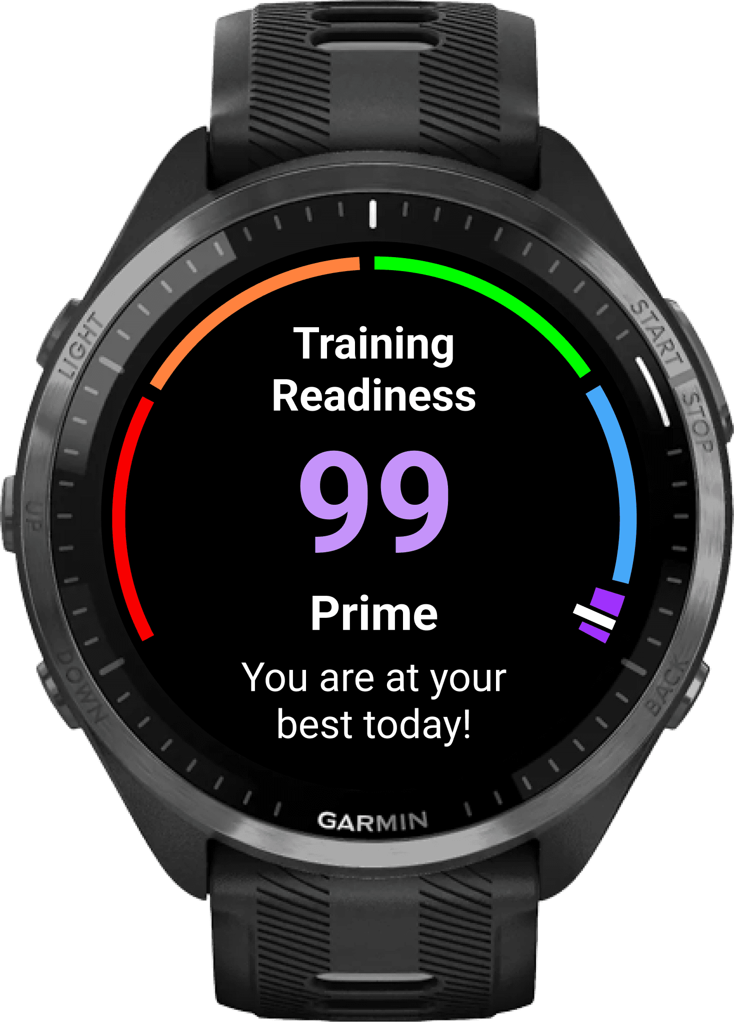
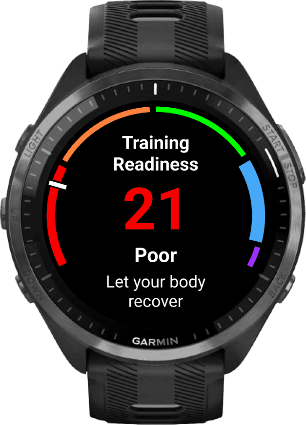
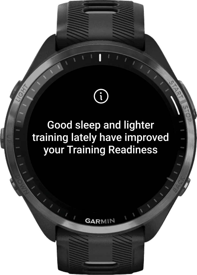
You can see it in Final designs section.
I designed different possibilities for main UI to find out whether users would like to see more verbal information, or numerical metrics.
Results were that the numerical metric was the key information users want to make it easy to compare between days, but they also wanted to have supporting verbal feedback to score.
I mapped more user journeys to find out possible corner cases we have to create designs for.
E.g. How the communication changes if user has already completed exercise today.
Based on the earlier work and feedback gathered, I finalized the designs for developer handoff.
Figma file with designs
Garmin features are designed for watch first
