Guided program to
reach your health goals

Guided program to
reach your health goals

Guided program to
reach your health goals

COMPANY
COMPANY
COMPANY

Veri

Veri

Veri

ROLE
ROLE
ROLE

UX Designer

UX Designer

UX Designer

EXPERTISE
EXPERTISE
EXPERTISE

UX/UI Design

UX/UI Design

UX/UI Design

YEAR
YEAR
YEAR

2022

2022

2022

About project

About project

About project

Providing clear steps on how to improve your health and well-being with the Veri app.

Team
Team
Team

Product manager

Two UX Designers (Including me)

Nutritionist

Doctor

Data Analysts

Developers

Product manager

Two UX Designers (Including me)

Nutritionist

Doctor

Data Analysts

Developers

Product manager

Two UX Designers (Including me)

Nutritionist

Doctor

Data Analysts

Developers

Background
Background
Background

One of the biggest issues in Veri app has been that people have felt that they are left alone with the data, and the guidance to provide clear steps to reach their health goals hasn't been quite there.

The goal of the project was to create a lightweight solution for a Program that educates users on their metabolic health, and different contributors affecting it, and makes the app more engaging to use.

User problems
User problems
User problems

Users weren't sure what they should do when starting to use the app

Users weren't sure what they should do when starting to use the app

Users weren't sure what they should do when starting to use the app

One of the common feedback we found when discussing with users was that they weren't sure what they should be doing and targeting to do in the app when they first started to use it.

→ We created Onobarding stage that goes through how Veri program works and teaches how to use the most important features in the app.

There weren't clear steps on what you should be trying to complete to reach your health goals

There weren't clear steps on what you should be trying to complete to reach your health goals

There weren't clear steps on what you should be trying to complete to reach your health goals

Especially in the longer run, there weren't clear steps and goals for users to reach in the app. Which led to a lack of engagement with the app after using it for a couple of weeks.

→ We created a program that focuses on one health contributor at a time to help users to reach their goals and increase engagement in the longer run.

Limitations
Limitations
Limitations

We are a small startup so we have to build feature very lean

We are a small startup so we have to build feature very lean

We are a small startup so we have to build feature very lean

To test out how users would actually engage with the program, we had to start by building the most essential building block, to create a shippable MVP version to market.

My role
My role
My role

UX designer

UX designer

UX designer

As a UX designer of the product, my responsibilities were to be responsible for maintaining the design process from the start to the final product, including discovery & definition, ideation & concepting, evaluation & iteration, and supporting developers with implementation.

Who I collaborated with

Tight cross-functional communication between data team, nutritionists and doctors to ensure that the solution we are building is in line with science

Tight cross-functional communication between data team, nutritionists and doctors to ensure that the solution we are building is in line with science

Tight cross-functional communication between data team, nutritionists and doctors to ensure that the solution we are building is in line with science

Since this project was heavily based on science, and data. It required almost daily collaboration with nutritionists, and doctors to maintain the scientific aspect of the feature. Every piece of information provided in the feature is backed by science.

Discovery & Definement

Discovery & Definement

Discovery & Definement

Clear need for more guidance in the beginning of app usage, and for more actionable goals to reach for.

How
How
How

User interviews & Surveys

Me and the team had user interviews and surveys around the usage of the app to discover more feedback about the app.

Feedback collection

Our customer love team keeps collecting information about the most requested topics, and pain points.

Competitor analysis

I explored how different apps are handling their programs for behaviour change, and if there are some clear aspects that seem to be working for them.

Ideation & Concepting

Ideation & Concepting

Ideation & Concepting

I started by studying more about behaviour change, and proceeded into creating concepts and prototypes that aligns with the behaviour change science.

Concepts & Prototypes

User journey mapping to discover how users should interact with the program.

User journey mapping to discover how users should interact with the program.

User journey mapping to discover how users should interact with the program.

I did some user journeys to figure out what aspects we should have in program in different touchpoints. It became clear that we need to create a tight loop between program stages, and daily actions.

Concept creation

Concept creation

Concept creation

I came up with multiple different concepts together with another UX Designer working on the project. We were presenting and discussing these concepts in tight loop with all the stakeholders in the product including nutritionists, doctors, and data engineers.

Behaviour change theories

I studied behaviour change literature

I studied behaviour change literature

I studied behaviour change literature

To make sure that the solution aligns with the behaviour change science, I studied behaviour change methodologies and literature.

I studied Self-Determination Theory (Ryan & Deci, 2008), Trans-theoretical model of change, etc. And also studies how the goal setting should be decides so that users stays as motivated as possible.

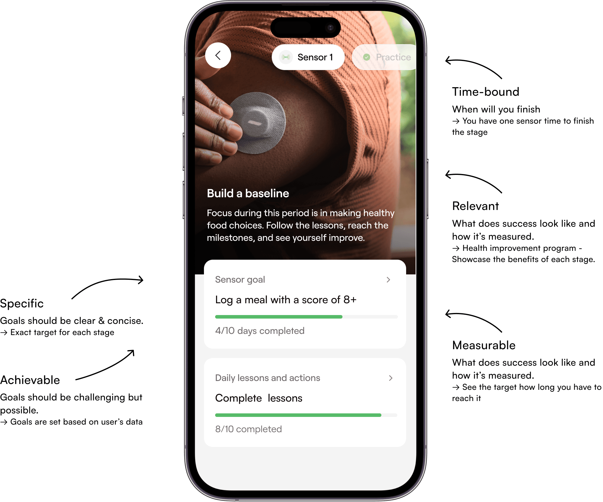
Program screen design based on SMART goal setting framework.

Evaluation & Iteration

Evaluation & Iteration

Evaluation & Iteration

Concepts created were tested with our users, and re-iterated based on the feedback received. The final designs were also tested, and the product was rolled out for small percentage of users to gather more feedback after actual usage.

How
How
How

Unmoderated concept testing

Unmoderated concept testing

Unmoderated concept testing

I created some concepts and prototypes around different possibilities we could have had and held an unmoderated user testing round in Maze.

Maze surveys were completed by our internal employees and our real users to figure out what aspects in the concepts are resonating with our users.

After iteration we also tested the final designs we made

After the concept testing we did some iteration on the concepts and worked on the more polished version of the designs. These designs were then tested again to ensure that everything is aligned with what we want to achieve.

Canary release

We released the program first for the small patch of our users to validate it with actual usage, and to see if there are anything to be fixed before rolling it out for all users.

UX/UI explorations for the Program Screen

The image was liked in the screen, to provide better connection to the stage, and it was also seen as "more human" screen compared to more minimalistic versions.

The image was liked in the screen, to provide better connection to the stage, and it was also seen as "more human" screen compared to more minimalistic versions.

  • POSSIBILITY 1

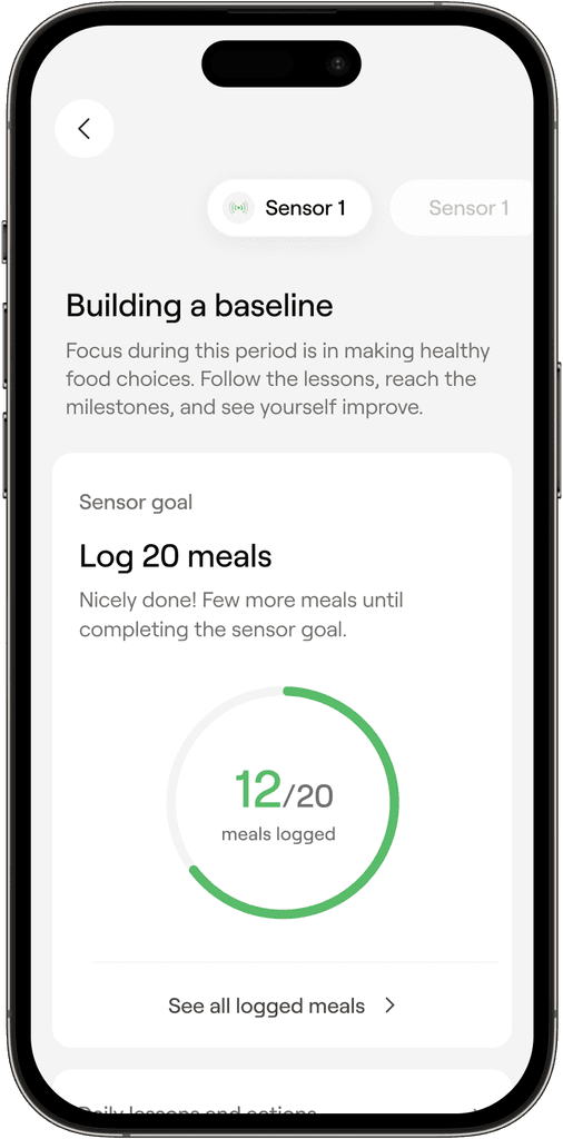
    Puts the main emphasis on sensor goals.
    Lessons are secondary item in this layout.


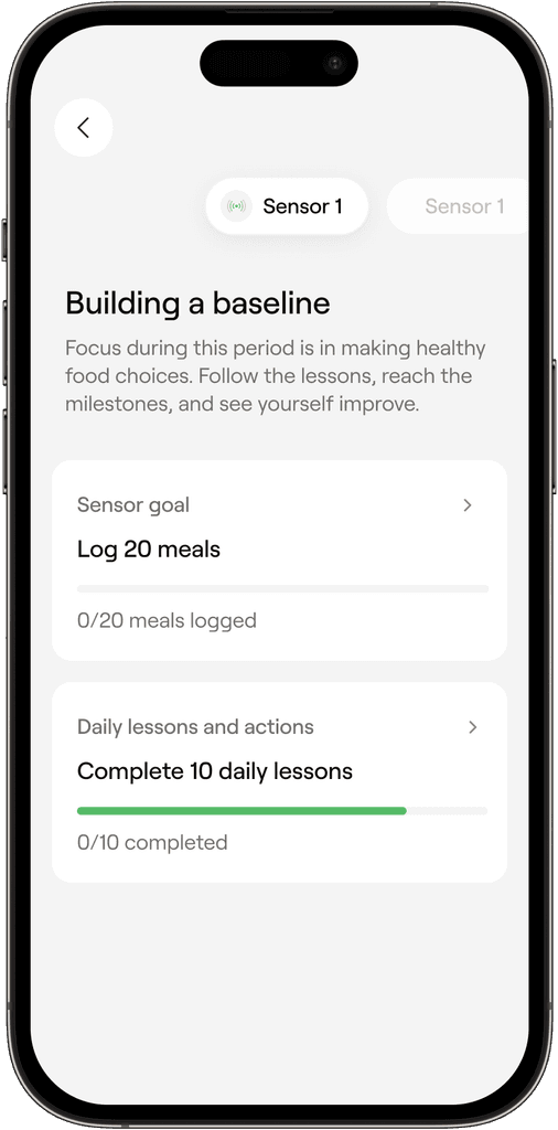
  • POSSIBILITY 2

    Daily tasks and sensor goals are hierarchically on the same level.

    This would allow us to have multiple goals at some point during the program.

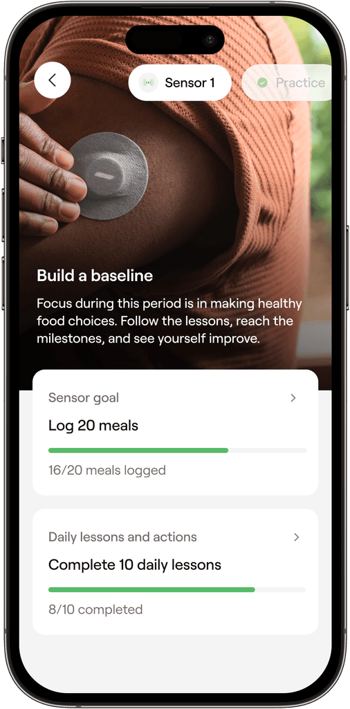
  • POSSIBILITY 3

    Same as the previous one but with an image.

    This could make screen more engaging and more aligned with the brand.

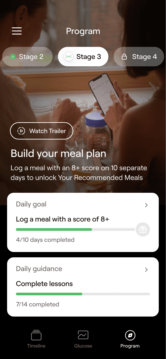
  • FINAL IMPLEMENTATION

    In the user tests people felt that the image was a nice anchor to have, and also they liked the darker variation of the screen.

Final designs

Final designs

Final designs

Based on the above steps, I finalized the designs for developer handoff, and also supported developers during the implementation.

How
How
How

Figma file with designs

Figma file containing all of the user flows, screens, corner cases, prototypes and copy needed for successful implementation.

Figma file containing all of the user flows, screens, corner cases, prototypes and copy needed for successful implementation.

Rive animations

I created interactive Rive animation for completing goals and showcasing the progress towards the stage goal.

I created interactive Rive animation for completing goals and showcasing the progress towards the stage goal.

Assisting developers with implementation

I also assisted developers to maintain the quality of final implementation.

I also assisted developers to maintain the quality of final implementation.

  • PROGRAM SCREEN

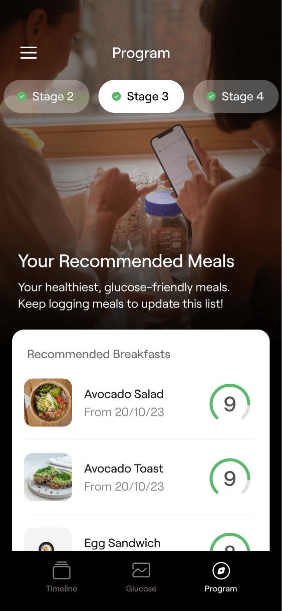
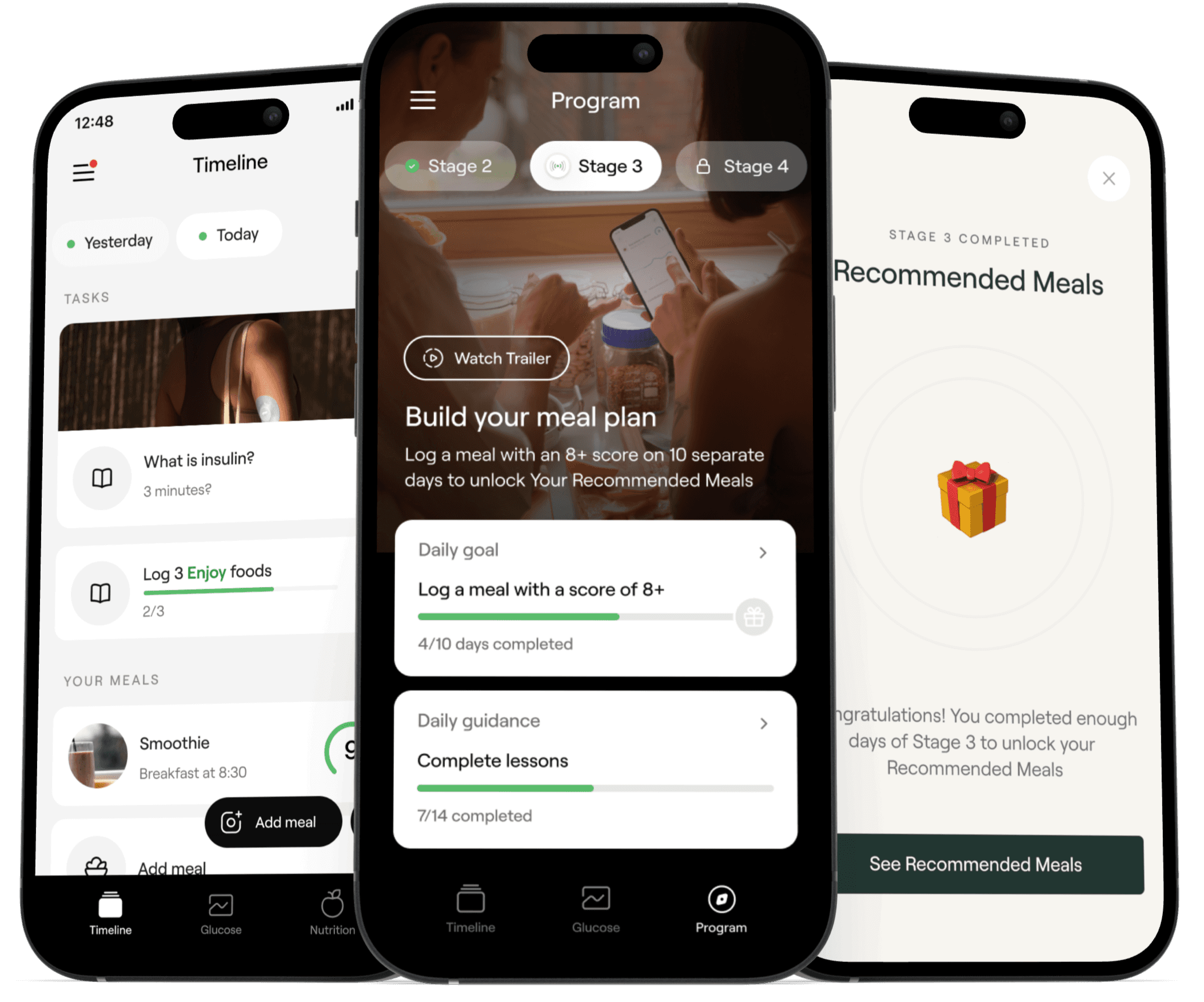
    Receive clear goals for each stage of the program. Complete the goals and progress to next stage.

  • COMPLETE STAGES AND RECEIVE REWARDS

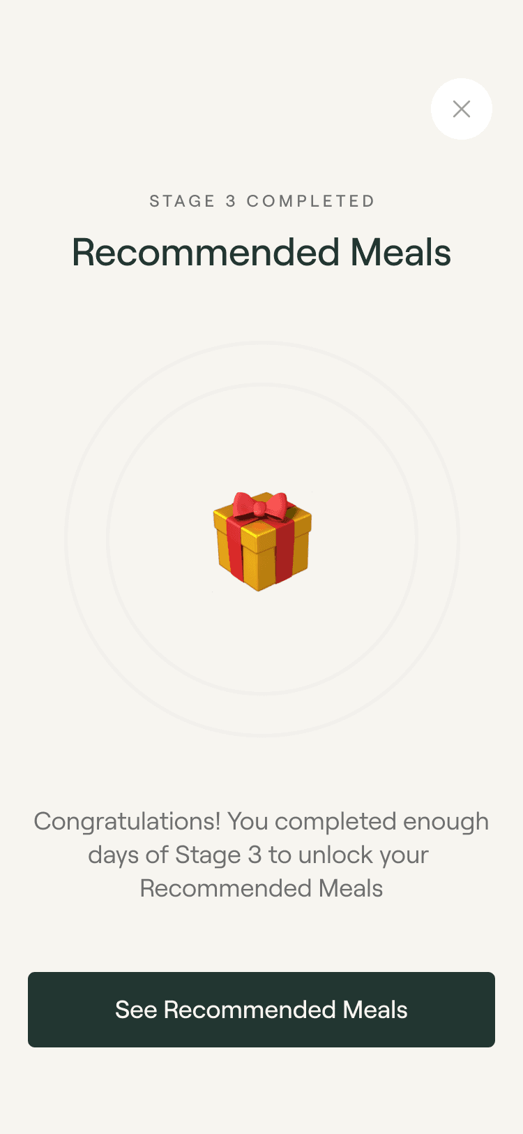
    To keep the program motivating users will unlock rewards as they progress with it. The more you use the app the better the rewards will become.

  • DAILY GUIDANCE

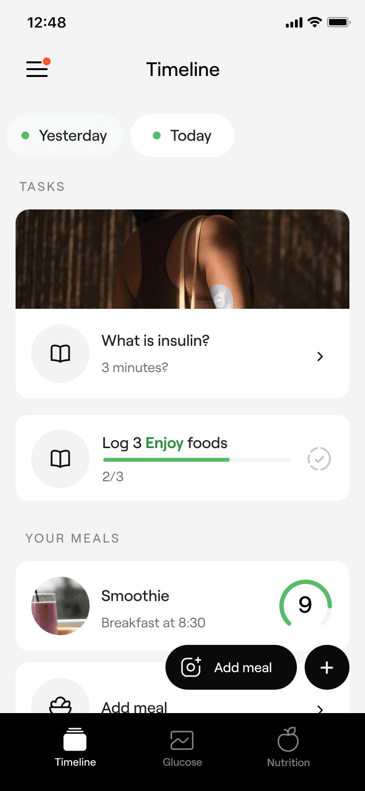
    Receive daily goals, and lessons to keep the experience engaging and motivating.

  • HOW TO EDIT FOODS

    Removing AI added foods and adding new ones are important features to make food logging seamless. Here's an video how easy it is to do with the new meal logging flow.

⭐️

Connect to Content

Add layers or components to make infinite auto-playing slideshows.

Results

Results

Results

The start for Veri program has received a great amount of positive feedback, and has improved retention with the app.

It has also improved the app onboarding a lot, when users are thought how to use the app and it's different features.

The start for Veri program has received a great amount of positive feedback, and has improved retention with the app.

It has also improved the app onboarding a lot, when users are thought how to use the app and it's different features.

The start for Veri program has received a great amount of positive feedback, and has improved retention with the app.

It has also improved the app onboarding a lot, when users are thought how to use the app and it's different features.

Improved onboarding experience

One of the biggest pain points in app was that people didn't exactly know what they should be doing. With the launch of Veri program the experience of starting with the app has felt easy, and we haven't received anymore feedback about this.

To make outstanding UX work, it still needs polished visual design in which I excel as well.

Improved onboarding experience

One of the biggest pain points in app was that people didn't exactly know what they should be doing. With the launch of Veri program the experience of starting with the app has felt easy, and we haven't received anymore feedback about this.

Helps people to not overload themselves

Especially helpful for many new athletes, who easily overload themselves by exercising too much.

Helps people to not overload themselves

Especially helpful for many new athletes, who easily overload themselves by exercising too much.

It's just a beginning

It's just a beginning

It's just a beginning

The purpose of Veri Program 1.0 was to see whether people would like following program

The first version of Veri program was shipped as quite small increment, and it's main purpose was to see whether people would follow program or not. And the results are very promising, and we are already building better version of the program.
Hear it from the users.

Hear it from the users.

Hear it from the users.

  • "The app is also very sleek and has a great UI. It is intuitive and provides lots of great information."

    -Veri user

  • "Veri has been one of the best things I've ever done for my health, having the information available really enables change."

    -Veri user

  • ""I have learned so much about becoming healthier and fully plan to continue my routine. The app is incredible!"

    -Veri user

Hi I'm Toni! 👋

Digital designer living in Zürich, Switzerland.

I have 5 years of experience in designing world-class products, ranging from global powerhouses like Garmin, to emerging startups like Veri.

I also build websites, so don't hesitate to reach out if you would like to improve your existing site, or create a completely new one.